Baltimore Ravens
Home - I'm fine with black as a jersey color, but I don't like a ton of it. I also don't mind purple that much, but I'm not a fan of purple overload. This jersey has both black and purple overload, and I can't stand this uni combo. The purple is very deep, therefore making it very close to black on the color wheel. A lack of piping on the pants, as well as very blain black socks, make this a hard sell for me. Score: 1.5/5
Away - This is slightly better than the home jerseys, though I think it's because there isn't so much deep purple against black. Score: 2/5
Helmet - Another reason I don't like the purple jerseys could be because it's A LOT of purple on a big guy. The helmets are pretty much uniform inside, and I don't feel like I'm getting smacked in the face with a particular color. The Ravens' original helmets looked like this. I think the logo they use now on the helmet is a substantial upgrade. Score: 2.5/5
Final score: 6/15
Pittsburgh Steelers
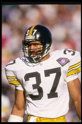
Home - One of the best in the league. The Steelers have a great color scheme, and the lack of change in the jersey shows us it's a classy jersey. Why fix something when it's not broken, right? However, I do wish they would go back to the block numbers worn until the late 1990s. Also, some striped socks wouldn't hurt. Score: 4.5/5
Away - It's hard to top the home jersey for the Steelers, but the white away unis are well above par. Once again, the Steelers just seem to look better with the older block numbers. Score: 3.5/5
Helmet - I love that the Steelers put the logo on only one side of the helmet. The hypocycloids are unique in the sports world, and the numbers and yellow stripe on the helmet add an old-school feel. If you ever wondered "Why is the logo only on one side of the helmet?" or "What the heck is a hypocycloid?" look here. Score: 5/5
Final score: 13/15
Cleveland Browns
Home - Another great jersey. Like the Steelers, not much has changed with this uni set. However, I'm sure some of you are wondering, "You said the Ravens' purple and black clashed because the colors were too similar. What about brown and orange for the Browns? Isn't that just as bad?" I get it. However, the Browns' jerseys have some details that the Ravens do not. First, the numbers and player names are in white, which offsets the brown jersey nicely. Secondly, they Browns have orange and white stripes on the sleeves which also helps break up the brown. Third, the Browns wear white pants, which again helps the eyes when looking at brown and orange up top. Score: 4/5
Away - Not a fan of the white jersey on white pants (though I'm not sure if wearing a white jersey with brown pants would be much better). Score: 2/5
Helmet - Plain, but it works. By itself, some might think it is ugly, simply because of the color. But, the helmet is part of a greater whole and it works. Score: 3.5/5
Final score: 9.5/12
Cincinnati Bengals
Home - I'm not quite sure where to start with this team. I understand the team wants to incorporate the bengal tiger into the uni somehow. I'm just not sure how to do it tastefully. The home jersey has so many problems that I'll just begin to list them:
- The "shadow effect" with the numbers is very 1998ish
- the tiger stripes on the sleeves are tough on the eyes, especially since there are tons of tiger stripes on the helmet only a few inches above
- the "piping" (technically piping is a stripe or stripes running down the length of the jersey or leg. While the Bengals' piping are literally stripes, it still is just a lot of orange and black to look at, without a linear effect. Score: 1/5
Helmet - By itself, I think it's fine. Technically, it does match the rest of the jersey well. However, it just gives off too much of an amateurish look (so does the home and away jerseys for that matter). While it's not much of an improvement, part of me wishes the Bengals would go back to this helmet from the late 70's and early 80's. However, it's just too similar to the Browns. They do orange the right way. Score: 1.5/5
Final score: 3.5/15
No comments:
Post a Comment